When looking to make your website perform better, A/B testing is a fantastic method to reach that goal. Today we’ll provide you with 5 types of A/B tests that you can use to help improve website performance of your online business.
What is an A/B Test?
An A/B test will compare two or more versions of a web page or element to see which one performs better. A/B testing can help you optimise your website for various online business goals, such as increasing engagement, conversions, or revenue.
[screenshot]
We’ve talked about the different kinds of A/B tests that you can use on your website, so be sure to have a read if you’re interested in more information about how A/B testing can benefit your website!
1. Typography
Typography generally refers to the style, size, and appearance of the text on your website. Using different attributes for your fonts can have an effect on the readability, aesthetics, and emotions of your visitors. For example:
- Contact us today!
- CONTACT US TODAY!
- Contact us today!
Fonts are generally considered to be an afterthought, often selected for what “looks good”, but font choice is worth testing as it has a subtle but powerful impact on how users experience your website content.
With A/B testing, you can test different aspects of typography, such as:
- Font type: You can test different font types for your web page content, such as serif, sans-serif, or script. For example, you can test whether a serif font type affects the readability or aesthetics of your content. With A/B testing tools, you can then measure what impact this has on the conversion rate of relevant goals, such as sales, leads, sign ups or page views.. You can also test different font types for different audiences, such as young, old, or professional, or even to target a specific interest of the user.
- Font size: You can test different font sizes for your web page content, such as headlines, body text, and calls to action. For example, you can test whether a larger font size increases engagement by being easier to notice, or if a smaller font size to hide less important information (such as for technical information for products) helps focus users on the content you want to push instead. You can also test different font sizes for different devices, such as desktop, mobile, or tablet to make sure that your content is having the impact you intend on every kind of device.
2. Calls to Action
Calls to action (CTA) are prompts that encourage your visitors to take a desired action, such as downloading, signing up, or making a purchase on your website. Using calls to action can heavily influence the click-through rates and conversions of your visitors by offering them a reminder and easy access to fulfil your goals. You can test different attributes of calls to action with an A/B test, such as:
- Position: You can test different positions for your call to action buttons or links. Whether placing them above the fold, below the fold, or in the middle of the page, different positions can affect accessibility, attention, and conversion rates. You can also test different positions for different types of pages, such as landing pages, product pages, or blog posts. One prime example of this is our own quick newsletter sign-up, which you’ll find just below!
- Text: Testing different variations of the text in the CTA itself that prompts users to take a desired action. You can test whether using more specific, descriptive, concise, or emotional words increases (or decreases!) click-through rates or conversions. You can also test different text lengths, formats, or tones to convey your message to potential customers.
- Colour: You can test different colours for your call to action buttons or links. Using a contrasting, complementary, or harmonious colour scheme may increase or decrease the visibility of your CTA.
- Style: You can test different styles for your call to action buttons or links. For example, you can test whether a round, square, or rectangular shape influences the performance of your CTAs. You can also test different shapes for different devices, such as desktop, mobile, or tablet, which may be easier to interact with or see, depending on the device.
Free Digital Tips Direct to your Inbox!
Be among the first to receive tips, advice and news on all things digital performance related. From new features in Google Analytics, Data Studio and other tools, to interesting articles, videos and more! Completely Free! (Unsubscribe any time you like!)
3. Layout and Design
When looking to improve the performance of your website, altering the layout or overall design can be a daunting challenge and have a significant impact. Layout or design will usually refer to the arrangement and appearance of the elements on your website, such as text, images, buttons, or forms. The layout of a web page can affect the user’s experience when navigating and affect how they reach and interact with other elements and content, such as call to actions or forms. With A/B testing, it is possible to test different designs and layouts. A few examples of these include:
- Lists, cards, or a grid layout: You can test different ways of displaying multiple products, descriptions or other information on your website. One example of a test would be whether a grid layout increases the number of products clicked on or even purchased on an ecommerce website. A grid layout can show more items in a smaller space and allow users to compare them easily, at the cost of losing some information due to the lack of space. Testing different layouts can help you find out which your audience prefers and interacts better with.
- White space (or blank space): This is the empty space between and around the elements on a web page. Different amounts of white space can influence the readability and clarity of your web page, by better separating sections or topics, or adding to your website’s aesthetic, with more white space usually creating a sense of simplicity and focus. A/B testing this can let you know which approach works better for your business online.
- Contrast: Testing different levels of contrast on your website, which is the difference in brightness or colour between the elements and the background (white contrasts black, for example). High contrast can increase the visibility and make areas of your web page stand out and catch the attention of the users. However if the contrast is too high it can appear quite jarring or aggressive, so A/B testing can help you find out what your visitors like the most. There are a few ways to create contrast, such as using dark backgrounds, opposite colours or even adding shadows to elements.
These are just some of the areas of layout or design that you can test for a website with an A/B test. By testing and optimising different ideas on your website, you can improve both the experience for your users, which may lead on to a better conversion rate for your goals.
4. Website Navigation
Navigation refers to the available methods that allow your visitors to access and explore different pages or areas on your website. While navigation normally covers menus and links and has many different designs, a common way to consider its effectiveness is to ask yourself a few questions:
- How many clicks do your visitors need to make from the homepage until they reach the product they want or form you want filled?
- Could their path be somehow shortened?
- Does the path you want them to take make sense and flow?
For example, you may have a contact form on a contact page. If you homepage has a link directly there, great – users can reach the page in a single click. However this journey only makes sense if they’re looking to get in touch right away. What if they want to view your products first? Does your product page have a link to the contact page, or a form?
A well designed and thought out navigation can greatly affect the user experience of your visitors, by allowing them to easily find what they’re looking for.
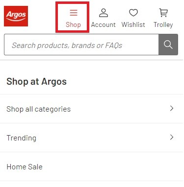
With A/B testing you can test a few different tweaks to your navigation, to see what works better for your visitors. One thing to test would be horizontal or vertical navigation, including on different devices (such as “hamburger menus” on mobiles) to find out which performs better.

Other tests could include adjusting what order menu items appear in, or what those menu items are. A/B testing can help you see how often users actually click on those links and compare the results. With this information, you can make informed decisions when making changes to your website.
5. Page Content
Page content refers to the text, images and other media such as videos that convey the message (the point) and worthiness (why they should use your business) of your website. Page content can have an affect on the interest and trust of your visitors. If content is boring with walls of text, or looks “spammy” and untrustworthy, then you should consider A/B testing it to see if you can improve performance.
There are a few different areas of page content that can be easily tested, including:
- Headlines: You can test different headlines for your web page, such as questions, statements, or commands. Is your current headline relevant to the content or is it just purely descriptive?
- Images: You can test different images on your web pages, such as photographs, graphics, charts or other illustrations. You can test whether a photo that shows a real human being increases the trust and engagement of your web page content compared to a similar illustration, or if using unique imagery relevant to your business works better than stock imagery available online.
- Main body text: Adjusting the main body text, such as including paragraphs, bullet points, or quotes, can impact your website readability. Quotes and bullet points in particular can help break up text-heavy sections and help draw the focus of your visitors to particular areas. Additionally you can also test different body text for different tones, such as formal, casual, or humorous, depending on the page content. Service pages may be better served with a serious, formal tone, whereas a blog post about a team day out may be more casual and humorous.
Bear in mind these are just some of the things that you can test with A/B testing. The purpose of these tests is to inform you beforehand about the impact of making (often expensive!) changes to your website. While a gut feeling may help in some cases, we find that taking a data driven approach always helps to improve website performance in as efficient a manner as possible.
Feel free to contact us if you would like to know more about A/B testing, analytics or reviewing the performance of your own website!


